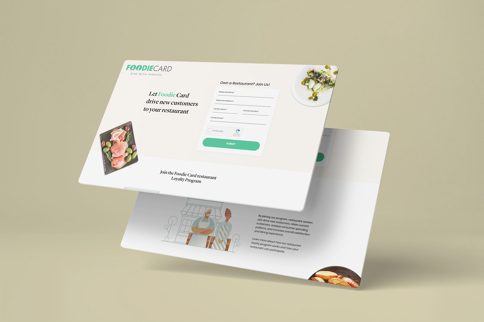
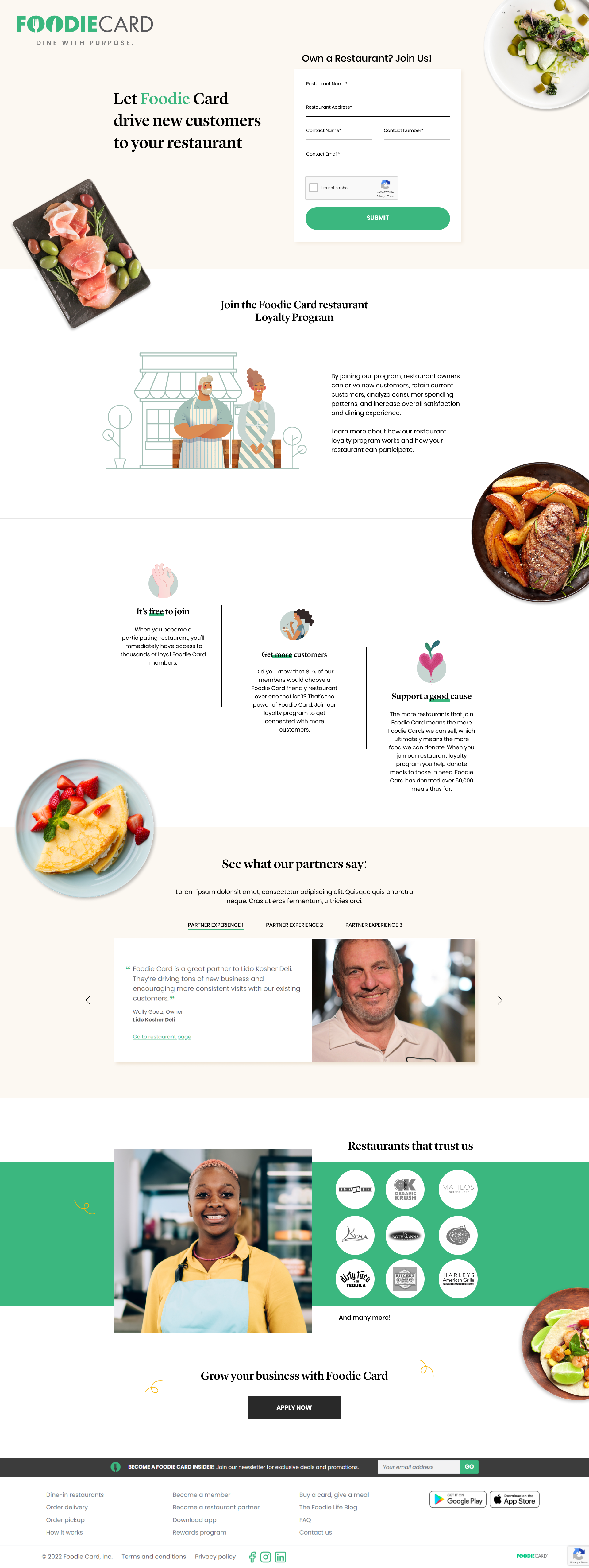
The redesign brought the brand to life with a lighter, fresher visual style. Illustrations, food photography, and playful details communicate Foodie Card’s personality and purpose more clearly. Benefits are broken into easy-to-scan sections, the value of joining feels more approachable, and the overall page feels more inviting to restaurant owners considering the program.
The Landing Page Before
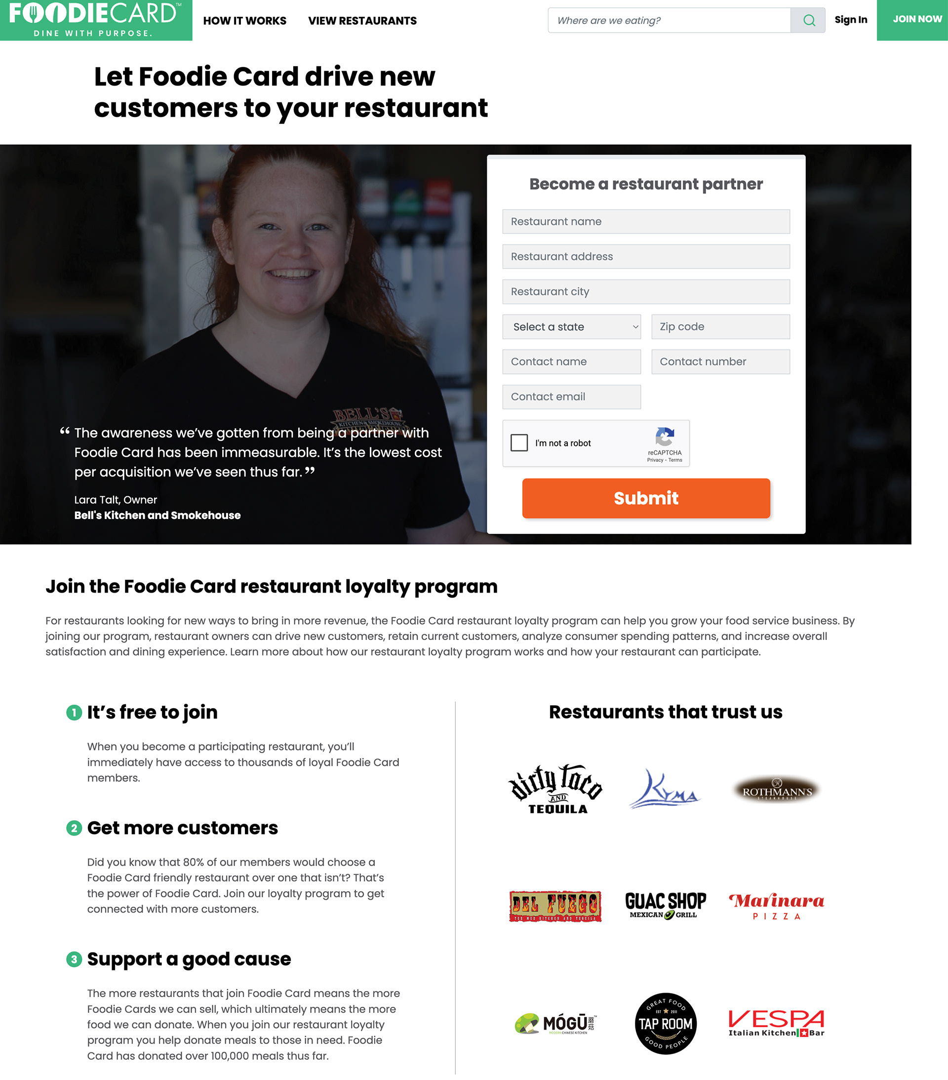
The original Foodie Card “Become a Partner” page leaned heavily on text blocks and a single testimonial photo. While it delivered the information, the layout felt corporate, visually heavy, and not particularly engaging. Key benefits were listed but lacked warmth, personality, and design consistency.